
First impressions! We finally get the new uniforms and after all the build-up, this is the result of the collective brain trust in Oklahoma? A color scheme and logo that has nothing to do with Oklahoma or even Thunder?
The NBA in OKC - Where Blunder Happens!
The blue/orange thing is fine, but after all these years of pining for an NBA team in OKC, of all the styles, options and choices they could make...this is the best Bennett and his ilk could do? They look like the Knicks, the Hornets, the Nuggets and half of the NBA. They are furiously devoid of creative uniqueness which seems spot-on apropos for a group that has bumbled this at every turn. Not ugly, not awesome...just simply indifferent.
They took a potentially menacing, albeit generic logo, Thunder, and stuck a yellow smiley face on it. Where's the dark, moody colors or intimidating logo? The sky blue is allegedly an homage to Oklahoma's sky blue flag. Isn't the sky cloudy and black when Thunder is rolling through it?
Merchandising is a huge part of the NBA pyramid scheme. With the Blunder's Dorito logo and generic jerseys, it’s hard to imagine anyone outside of OKC jumping on the bandwagon. They will never maximize profit potential this way. With the economy spiraling downward, you have to fight for the consumer dollar. A killer logo and color scheme would've at least made non-fans consider consuming OKC hats and jerseys, simply out of the novelty of a new team. Consumers will consume. There is nothing unique or awesome about this team's uniform or logo to consume. A missed opportunity. Watching the video of the unveiling, you could just see Durant cringing and asking himself "how much longer do I have to be in this disaster movie?"
The failure to create a logo/uniform that satisfies the fans and the team, while maximizing it's potential in the marketplace, is indicative of an ownership group that has a small market mentality in a big market game. It's further proof that this group is unlikely to take this team to the next level. It's a dagger to the OKC fans who've yearned for an opportunity like this, only to watch it bumbled on several levels.
It's ironic that Bennett and Presti’s agenda in Seattle was to decimate the team to ease to move to OKC. They may never be able to build it back up from the same cellar they created. The team, picked dead last in the NBA power rankings, has a good chance of staying there for a long time because of one blunder after another, CBA uniforms and because NBA superstar talent, like Durant, need and deserve a bigger stage than the 45th market can possibly provide. Durant is likely long gone at his first chance. Just like OKC’s chance for a good first impression is long gone.
Subscribe to:
Post Comments (Atom)


8 comments:
Actually, idiot, the blue in the uniforms is an ode to the color of the state flag of Oklahoma.
Research a little?
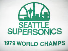
And nothing can beat the menacing and intimidating logo of the Supersonics. I, for one, am very frightened of the Space Needle.
LOLOL! Space Needle is the essential backdrop of Seattle and makes complete sense. OKC names themselves Thunder, has a doritos logo and then they thug the Knicks/Liberty colors. Classic! If you're afraid of heights, the Space Needle could seem intimidating. Nothing to be ashamed of...but them unis are!! Owned!
Man..I have to agree. It looks like they ripped the colors of a bunch of teams..including the Bobcats for crying out loud.
BTW most people wouldn't know about the state flag being blue..
I thought it was probably tornado grey...
So where did the Sonics get their colors from? A can of pea soup?
Each color in the Thunder's color scheme represents something to Oklahoma.
Blue represents the state flag.
Red represents the University of Oklahoma, as well as the state name, which is Choctaw for "Red people".
Orange represents Oklahoma State University
Gold represents the color of the sun.
Again, a little research would give your pathetic "blog" some sense of respectability.
Those white things look like Denvers, the blue are totally the Knicks. That's pretty weak. Looking at that logo, I am suddenly craving Doritos!
haha, they'll be the best dressed WNBA team in the league. i wonder if Sheryl Swoopes will be picked up to replace Ridnour at PG
Any team is better than the Seattle Non-Existants.
Scoreboard! :)
Yours Truly,
Anonymous Coward
(in a city with a basketball team)
Some of these "negative" posters have told you to do some research about the Blunder's colors, and yet, they're being downright ignorant themselves when they question the colors of the Sonics. Such hypocrisy if I ever saw it.
And to the "Anonymous Coward", sorry, but according to the recent ESPN NBA Power Rankings, your Blunder are dead last, which where they'll be for the majority of their first season in OKC.
Post a Comment